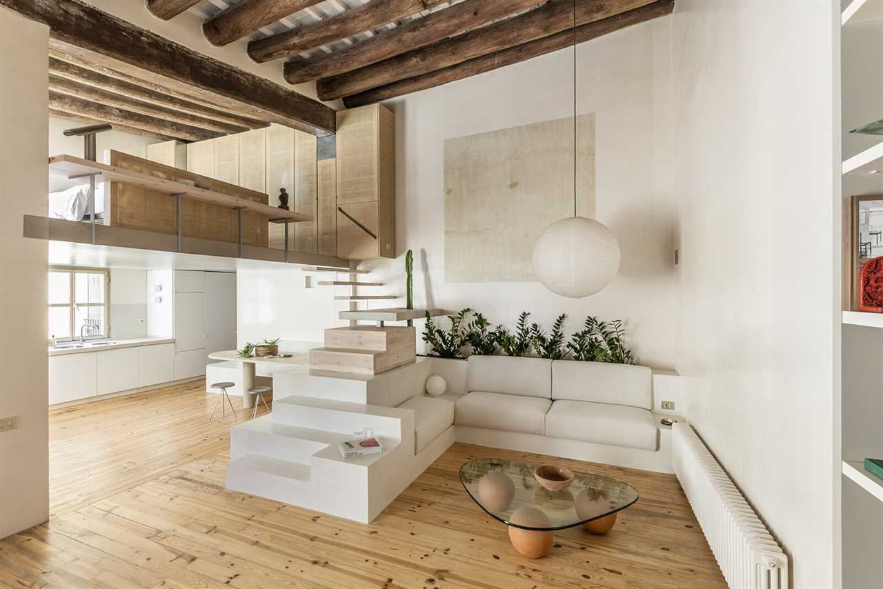
Its melange of treads serve as the centerpiece of this elegantly renovated wabi-sabi flat.
Houses We Love: Every day we feature a remarkable space submitted by our community of architects, designers, builders, and homeowners. Have one to share? Post it here.
Project Details:
Location: Barcelona, Spain
Architect: Colombo and Serboli Architecture / @colomboserboli
Photographer: Roberto Ruiz / @roberto_ruiz_photography
From the Architect: "The apartment is located on the third floor of an ancient building near the famous Palau de la Música in the heart of Barcelona. The client is a young Italian fashion designer who wanted to live in the Catalan capital.
"Visiting the property, the architects were immediately struck by the space’s open proportions and five-meter-high ceilings. The project highlights and embodies several charming existing elements such as the massive wooden beams and wooden floors, the mezzanine overlooking the living area, and the two-floor metal windows. A solution was needed to rationalize a very compact bathroom and substitute stairs to the second level due to structural problems.
"The property is extremely quiet, overlooking silent courtyards of the old part of Barcelona. The client wanted an equally calm, neutral palette of materials and colors and preserve and enhance the property’s atmosphere and to ‘keep it simple and warm.’
"The designs solutions are informed by the client’s desire to keep the appeal of original elements and weathered materials. The architects decided to face the project through a ‘wabi-sabi’ approach that could easily incorporate original features and imperfections, while retaining the charm of the apartment. Shapes are simple and bold with recurring basic forms: squares, circles, spheres—while sturdy solid surfaces were used to combine the monumental language of existing elements.
"Colombo and Serboli immediately found a resemblance between the apartment’s spaces and the architecture of Luis Barragán, always a reference for the firm. The work of Carlo Scarpa is also suggested in the sculptural stairs and furniture piece, central to the space, that defines the whole project.
"The concept is built around the idea of a multifunction block, a layered central element, around which the space and activities develop. The layout has been kept completely open, loft-like.
"The dining area grows out of the central stair element. On the kitchen side the block has niches, openings and shelves to contain tableware pantry. A massive, arch-shaped slab of travertine marble protrudes out of the block to create a one-legged dining table and bench. A little square niche hides a spotlight, a disguised sconce.
"The stairs are conceived as layers of materials, connecting the two levels, getting lighter as they go up. The initially solid plinth is surmounted by steps as a wooden block. Then stairs bend into a suspended micro-cement landing with a half circle shape cut-out to allow a taller plant to grow through it. The last few steps, in light color wood are floating atop, doubling as light source above the dining table, thanks to a trim of led lights.
"On the second level, the bedroom area is open onto the living. A wicker panel functions as both headboard and balustrade. Around it runs a ledge suspended in the double-height space—a quote from Halston House, the 1960s Paul Rudolph project. This forms two bedside tables at the extremes, as well as a display shelf for the living area overlooking the double-height space. Here, the closet dominates as a warm monolith, clad in woven wicker screens. One of these screens hides the door to a small bathroom, while another conceals a hand washbasin within a mirrored box, placed within the bedroom. A third embodies the stair’s handrail, through a diagonal cut.
"The bathroom is covered in vertical ceramic tiles with an elegant nacre finish, adding a new texture to the matte-to-shiny palette of neutral shades of the apartment.
"The architects played with different finishes from glossy to rough with the otherwise neutral palette. Materials have been selected with a tactile- and texture-based criteria: white microcement for the stairs and seat’s block, light natural wood, woven wicker panels, etc. Enameled painted walls reflecting the light contrast with matte microcement, rough travertine slab and porcelain kitchen tops. A textured bouclé fabric was picked for the seat cushions. Brushed steel details complete the palette, like in the bespoke cooker hood."
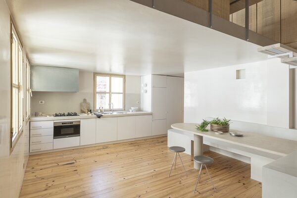
Photo by Roberto Ruiz
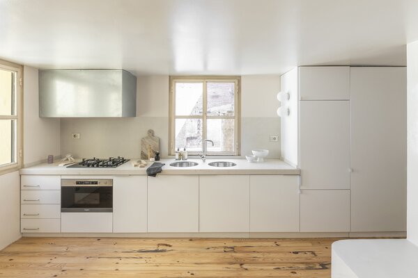
Photo by Roberto Ruiz
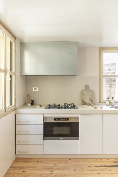
Photo by Roberto Ruiz
See the full story on Dwell.com: A Puzzled-Together Stair Elevates a Fashion Designer’s Barcelona Apartment
Related stories:
- A Sawtooth Roofline Meets Deco-Inspired Curves at This Family Home in Australia
- This L.A. Home Has a Yellow Crane That Relocates the Dining Table, Because Why Not?
- A Basement in Greece Finds a New Purpose as a Space-Saving Apartment
Read More
By: Grace Bernard
Title: A Puzzled-Together Stair Elevates a Fashion Designer’s Barcelona Apartment
Sourced From: www.dwell.com/article/palau-apartment-by-casa-wabi-sabi-design-fbcda50e
Published Date: Mon, 19 Dec 2022 20:42:01 GMT
.png)


