.png)
Most started with neutrals. But in recent years, they’ve shaken things up—pushing their customers, and getting inspired by them, too.
If you’ve noticed what feels like an explosion of color across the home and kitchen spaces in the last few years, you’re not imagining things. In recent years, the all-beige minimalism that so boringly dominated the 2010s has been replaced with bright colors, in the form of sheets, rugs, and even kitchen essentials. This trend has been particularly palpable in the faster-moving direct-to-consumer (DTC) space, with brands like Framebridge and Our Place, initially launching (in 2014 and 2019, respectively) with mostly neutral product lineups, starting to release bolder red, blue, green and even purple colorways in recent years.
Besides the obvious—starting simple is easiest for a brand, and following trends is usually a later step—I was curious about the push here. So, to get to the bottom of it, I spoke with color decision-makers at four DTC brands that you’ve probably seen on Instagram, if not in your own home: Framebridge, Quince, Our Place, and Ruggable. They shared insights on what goes into the product color-selection process and the trends they’re seeing play out at their own brands.
The origins
To better understand how we got here, we have to go back to the early 2010s. "Framebridge really started in the Apple Store aesthetic, Instagram era," says Tessa Wolf, head of merchandising at the DTC custom framing start-up. "So everyone wanted that cool bright white everything." Brands launching during this era sought to strike a fine balance between playing it safe with the neutrals market research said customers wanted, and the bold shades they couldn’t find anywhere else, helping them stand out when customers were online shopping. For Framebridge, that initial pop of color came a few months after their launch via a striking glossy red option that complemented a palette of more neutral frames. Now, they have a tightly curated assortment of about 70 frame styles available in multiple colorful shades like royal blue and emerald green.
Colors also made their way into the kitchen space—albeit slowly. "When we launched Our Place, most kitchenware was overwhelmingly black and stainless steel," Kristina Wasserman, VP of product development and design at the cult-favorite nontoxic cookware brand, explains in an email. In addition to warm beige and black with brown undertones, the brand also added navy and terra-cotta to its launch lineup as a strategy to differentiate itself.
Quince, an affordable luxury DTC retailer that expanded from fashion and home offerings to almost every product you could ever need, initially launched its linen and percale sheets in white, gray, and sand colorways. "In general, we usually like to launch with the top-performing colors we see in the market and build the offerings from there," writes Anisha Rajopadhye, the company’s merchandising manager of home textiles, in an email. The brand now offers sheets in blue gingham, red bordeaux, pine green, and dusty mauve colorways, to name a few.
As more brands continued to take big color swings, customers began requesting more and more shade options.
Quince’s European Linen sheet set, as seen in pine.
Courtesy Quince
The evolution toward color
Initially, many of DTC homeware brands experimented with color through limited-edition collections or influencer/celebrity collaborations, which quickly saw real returns. By using color, ordinary household goods like pans, sheets, and picture frames became items that consumers would proudly display on their kitchen counters, beds, and walls.
Ultimately, how far customers are willing to go with color is also dependent on the product itself. Many are more willing to spring for a bold color for home items that can be easily swapped out than for more permanent (or expensive) purchases like furniture.
For a brand like Quince, this is especially noticeable across product types, specifically throughout its bedding offerings. "Bedding is a core essential for people, it’s something that they use daily and for extended periods of time…while infusing playful colors is also important, grounding our assortment in year-round neutrals is always a priority," writes Rajopadhye. This is also true with a more permanent home decor fixture like rugs. The DTC washable rug brand Ruggable’s goal "is to offer something for every person, from tried-and-true favorites—neutral hues and earthy, muted tones—to more trend-forward colors in order to evolve with our customers’ tastes," writes Maria O’Brien, the company’s VP of global design, in an email. Striking the balance between a standard range of neutrals and knowing what customers want color-wise from different product types is the key to staying competitive in increasingly crowded markets.
Despite all of the online marketing DTC brands have become notorious for, one approach to product color expansion came from a surprising source. As some of these brands transitioned from being solely online retailers to having brick-and-mortar stores, consumers seemingly started to make bolder color choices. "When Framebridge opened retail stores, people started getting braver. When they could see the products in person…they were able to make bolder choices than they would online," says Wolf. The brand opened its first store in 2019 and used its physical locations as an opportunity to gently push customers toward more colorful selections, especially through the frames displayed in stores. "We were like, okay, people are interested in more color, and we need to find a way to give it to them," she explains.
The journey from limited-edition product to permanent offering looks different at every brand, but at Our Place, which launches three to four new colors a year, customer reception is the clearest indicator. "If a seasonal shade sells out quickly or we see sustained demand, we revisit its long-term potential," Wasserman writes. "When a color proves it can live beautifully across seasons and in customers’ homes, that’s when we consider making it part of the permanent collection." One example she named is an initially limited-edition lavender shade that remained in the collection for two years after many sellouts and restock requests.
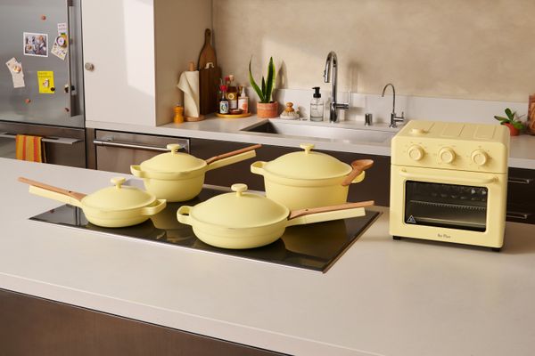
Our Place’s cookware in Butter Yellow.
Courtesy Our Place
Behind the color selection process
For all brands, customer feedback and product performance data are the clearest indicators of whether a product offering is resonating, and which shades to invest in next. Future color decisions are typically made about a year or so in advance, making it imperative to try and accurately predict what consumers will be looking for. These inspirations run the gamut: Pantone’s Color of the Year, Beyoncé’s Cowboy Carter album, Taylor Swift’s Eras tour, or even the 50th anniversary of Saturday Night Live have all served as inspirations for the products customers end up coveting.
At Our Place, Wasserman says inspiration from fashion, interiors, art, and cultural mood shifts also contributes to the brand’s color decisions. "Whether it was a bold acid-green drop (brat before brat!), a nostalgic cottage butter yellow, a rich espresso, or the just-right shade of cream that interior designers obsess over," Our Place’s goal was to make every color drop feel as relevant as possible."
For Framebridge, stores serve as a direct channel for customer feedback, especially when customers are looking for colorways that the retailer doesn’t yet have. "We started seeing what was coming up again and again, and it made us realize we had some gaps that we needed to address," says Wolf. This led the brand to expand its frames into unexpected shades like bright orange and purple.
Current color trends
Ultimately, for many consumers, neutrals will always be king. But for those brave enough to experiment, retailers are seeing some intriguing trends. For Framebridge, Mulberry, a reddish-brown, has continued to be more popular than traditional black-and-white options. Blue is also very popular, especially in the brand’s latest collaboration with Farrow & Ball. Other standout colors across the brands include shades of green like sage, olive, and emerald, dark brown, cool blues and grays, and burgundy. So despite Pantone predicting stark white’s big comeback, DTC brands are still betting big on color continuing to dominate.
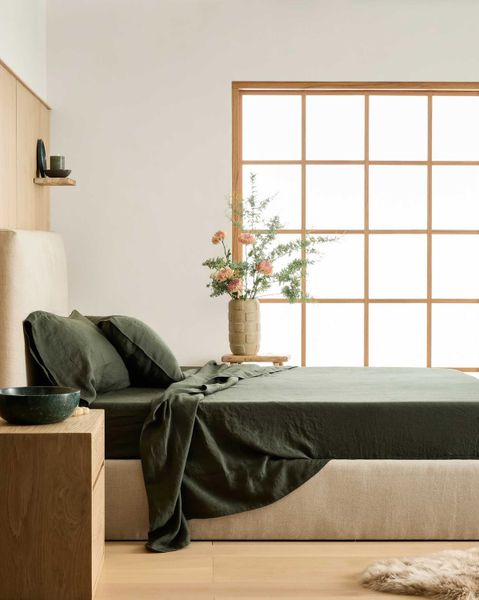
Top photo courtesy Ruggable
Related Reading:
Before & After: Color Runs Wild in This Once-Beige Clinton Hill Apartment
Do "Color of the Year" Announcements Actually Influence Trends?
Read More
By: Maliah West
Title: How DTC Homeware Brands Decide Which Colors to Bet Big On
Sourced From: www.dwell.com/article/how-dtc-homeware-brands-decide-which-colors-to-bet-big-on-ffd4d2dc
Published Date: Mon, 12 Jan 2026 19:51:05 GMT
Did you miss our previous article...
https://trendinginbusiness.business/real-estate/is-the-door-closing-on-firstgeneration-homebuyers