More than half a century since the sitcom’s debut and 30 years since its live-action movie release, the lasting influence of the cheeky Bedrock aesthetic shows what a powerful alchemy the two styles had.
When The Flintstones debuted in September 1960, the show broke down a lot of barriers—especially considering it was a cartoon sitcom about a galoot, his wife, their dinosaur dog, and their neighbors living a suburban life in the Stone Age. The Flintstones was the first prime-time animated series on American television, and the country’s first animated series to show two people of the opposite sex sleeping in the same bed—though how they could sleep on a bed made of solid rock is really anyone’s guess.
With pieces like that bed, though, The Flintstones also helped inspire a design aesthetic that’s arguably become one of the biggest parts of its legacy. Though Ed Benedict, the animator who first designed the show’s universe, reportedly claimed he did it all off the cuff without using references for the show’s buildings, save a few prehistoric cave paintings he’d looked up in some books, it’s hard to deny that the show seems to pull much of its visual references from the midcentury-modern structures that were popping up at that time all over Southern California, where the offices of the show’s production company, Hanna-Barbera, were located.
The setting for The Flintstones, Bedrock, channels equal parts Palm Springs and Arches National Park, merging chunky, organic materials and natural shapes while paying tribute to streamlined ranch homes with their slab roofs and wide, open windows. That prehistoric-meets-midcentury-modern look has since influenced some architectural projects, and become its own lasting aesthetic, called Bedrock or Flintstones chic.
Clearly not everything that pulls from Stone Age-like design takes inspiration from The Flintstones—vernacular buildings, for example, have been made from natural materials for centuries, and the use of rugged materials like stone and wood also characterizes existing styles, like postindustrial design and brutalism. But there is a particular aesthetic in the recent zeitgeist that just feels Flintstones. It’s childlike and playful, experimenting with proportions and embracing quirks like rough or jagged edges and circular legs. The materials may have been used before, but there’s a bit more cheekiness to Flintstones chic, and a bit more joy.
A 2022 Interiors Addict article pointed to Australian interior stylist Tim Neve’s debut furniture line as an example of the aesthetic, with much of the pieces made out of thick, durable materials like teak and travertine. There’s a midcentury-inspired coffee table with a chiseled stone top set on massive wooden ball feet, and a sling lounger with a leather seat and thick peg supports that looks downright Stone Age.

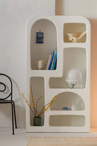
The Stone Age-inspired faux stucco bookshelf from Urban Outfitters’ Isobel line, which includes a coffee table, sofa, and wall shelf.
Courtesy Urban Outfitters
Speaking of the Stone Age: when Clever wrote about the Flintstones look back in 2020, it was with references to Metopë Studio’s Otti Coffee Table, with its thick Australian siltstone supports, and Urban Outfitters’ fairly successful attempt to capitalize on the recessed shelf craze. Earlier this year, the Financial Times covered Los Angeles furniture designers who create pieces that are cartoonishly simple yet beautiful, like Objects for Objects’ Barney Rubble Kids collection, with its zigzagged wooden chairs and peg-legged tables.
Perhaps designers and buyers alike are drawn to the Flintstones look as a rejection of technology, or of the sleekly manufactured products that seem to surround all of us all the time. In a 2020 Yellowtrace article, the online design publication’s founder, interior designer Dana Tomić Hughes, wrote that because her "daily existence is saturated in slick technology," she’s drawn to "objects with supreme tactility, pieces that celebrate the crude essence of rocks and stones, and spaces that place natural, rough materials as a central theme in their thinking." These pieces, she says, sit in strong juxtaposition to modern life, reminding us of the interplay of nature and design and of handicraft and technology.
Flintstones design also reminds us of our past. These cartoonish items make us nostalgic for Saturday mornings spent watching cartoons, as well as sleek, midcentury design. They also often remind us that the Earth has a memory of sorts. California woodworker Vince Skelly crafts pieces out of massive chunks of wood or even naturally felled trees not just because it’s eco-friendly, but because it gives a piece inherent age and gravitas, while Australian designer Ryan Mueller created a whole line of lighting made from Barrabool sandstone. These are materials that were "born" long before, for example, YouTuber Emma Chamberlain, who told Architectural Digest in 2022 that her massive bathroom slab sink gives her house "Flintstones energy."
Bedrock chic isn’t just about looking back, either. Though The Jetsons, a futuristic Flintstones spin-off that came out two years after Fred and company grabbed hold of America, is often cited as having the ultimate aspirational cartoon environment, with its wild technologies and spacey, Googie-inspired architecture—Smithsonian once called the show the "single most important piece of 20th-century futurism"—there’s a lot to dream about in Bedrock, too. While it’s easy to look at The Flintstones and think the animators just slapped together some rocks in a house shape and called it a day, in fact they too created their own utopia—one where cave people still wore animal skins but lived in a suburban home stocked with all manner of prehistoric conveniences, like a "pigasaurus" garbage disposal.The Flintstones design aesthetic, in turn, plays on that perfection, creating not only a cartoon-like world that we can all actually inhabit, but a place where simpler is better and the natural is appreciated more than the technological. So while we can all count ourselves lucky that we don’t have to use our feet to power our cars or sleep on a solid granite slab, the seeming embrace of Flintstones chic means there could still be a little Stone Age somewhere in all of us.
We love the products we feature and hope you do, too. If you buy something through a link on the site, we may earn an affiliate commission.
Top photo © Hanna-Barbera, Courtesy Everett Collection
Related Reading:
Are We Heading for Another Attempted Waterbed Revival?
The Neon Paradox: Is it Low Brow or High Art?
Read More
By: Marah Eakin
Title: How Midcentury Modern Met the Stone Age to Create Flintstones Chic
Sourced From: www.dwell.com/article/flintstones-chic-midcentury-modern-stone-age-bedrock-aesthetic-4c4ccbfe
Published Date: Thu, 23 May 2024 19:35:07 GMT
Did you miss our previous article...
https://trendinginbusiness.business/real-estate/peter-knag-joins-offerpad-as-cfo
.png)


