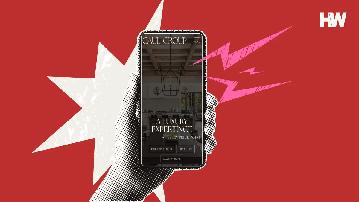
.png)
As a Realtor, your real estate landing pages are one of your most valuable lead generation assets. They are the final gatekeepers between you and your lead. Get them right, and your ROI from paid leads will soar. Get them wrong, and your conversion rate will plummet. It’s no wonder that most Realtors, and even some marketing companies we won’t name, struggle with them.
Luckily, you don’t have to reinvent the wheel. To help, we’re giving you a guide all about landing pages and the elements you need to create one, as well as seven examples of high-converting real estate landing pages. For each, our team of expert agents, brokers and real estate marketers breaks down why they convert so well, and how you can copy their strategies.
What are real estate landing pages?
A real estate landing page is a page on your website that has only one goal: to convince someone who clicked on your ad to give you their contact information by offering them something of value in return. Simple, but not easy.
Landing page success = A single offer in exchange for contact info
The key to converting curious visitors into leads on your landing pages is to focus on a single offer that’s both clear and compelling to them, gets them to trust you and uses subtle persuasion techniques to convince them to provide their contact information.
It’s helpful to think of your landing page as an elevator pitch. In simple terms, here’s how it works:
You will:
- Present your offer
- Explain the benefits
- Try to address objections before they arise
- Close by asking your prospect to take the next step.
In exchange, they will:
- Provide contact information in exchange for your value-add and/or services
Elements of high-converting landing pages
Building landing pages that convince someone to give you their email address is part art, part science. Luckily, others have already done the work for you. Thousands of creative writers, graphic designers and tech geeks (including ours) have already tested what works on landing pages.
Here’s a breakdown of each element:
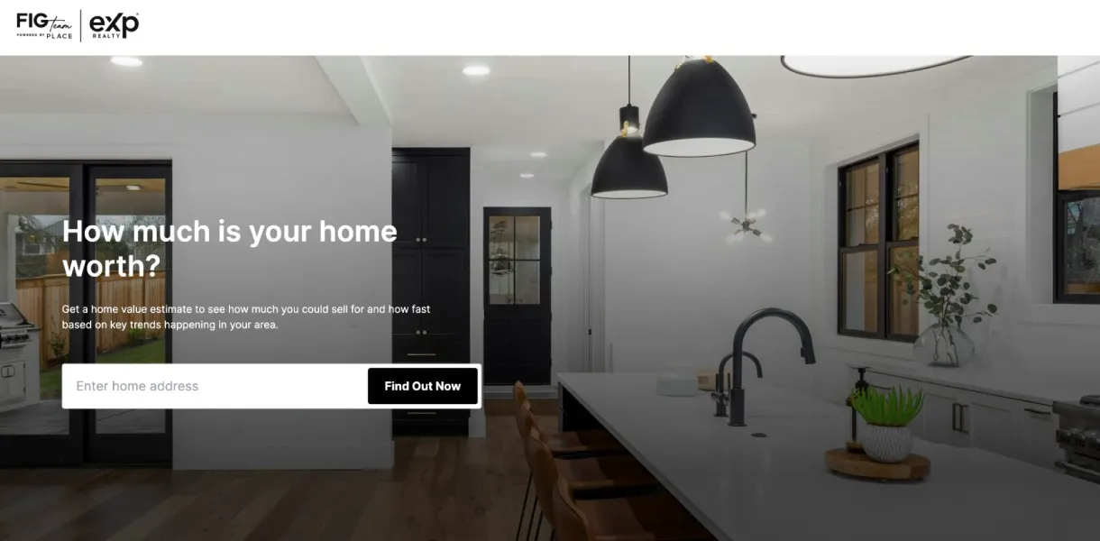
Element 1: A bold, eye-catching headline with a single compelling offer
Your headline must clearly explain your offer and, ideally, the benefits of accepting it. The key to great headlines? Keep them simple. Your visitor clicked on your ad, so they are already at least somewhat interested in your offer. Your headline must reassure them they are in the right place, and convince them to either accept your offer or keep reading to address their objections or concerns.
- Example: “How much is your home worth?”
- Objection handled: “Am I in the right place?”
Element 2: A subheadline that reinforces the benefits of the offer
Your subheadline reinforces the benefits of accepting your offer from your headline. Again, keep it simple. They already clicked on your ad and read your headline. Now you need to go a bit deeper into the benefits to keep them reading, or, better yet, to give you their email.
- Example: “Get a home value estimate to see how much you can sell for and how fast based on key trends happening in your area.”
- Objection handled: “Is this offer really what I want?”
Element 3: A single and persuasive call to action (CTA) button
Your CTA button is where the rubber meets the road. A good CTA button will help your visitor overcome their last-second hesitation or resistance to handing over their email address. This is why it should be the most prominent element on your page.
Design: Your visitor should be able to see your CTA button from across the room, in the dark. Color matters. Use a color that contrasts with the rest of your landing page, and ONLY use this color on your CTA button!
Copy: Use short, compelling and friendly copy on your button that highlights the benefit of clicking it. Avoid dull or clinical-sounding words like “Submit” or “Click here.” Again, your CTA is the most crucial element on your landing page!
- Example: A bright orange button on a white background, copy: “Find out now”
- Objection handled: “Do I really want to give this person my email address?”
Element 4: Persuasive copy that goes deeper into the benefits of the offer
While many people will click on your CTA button immediately, others will require more convincing. Add more copy to your landing page to go deeper into the benefits of accepting your offer and address any objections your visitor may have. As with everything else on your landing page, keep it simple. Use bullet points, icons or images to break up your text. Keep paragraphs short and use concise, simple and persuasive language.
As you write, try to anticipate the objections your visitor might have and address them in your copy. Note, you won’t always need persuasive copy on your landing pages. A good rule of thumb: the bigger the ask, the more persuasive copy you will need to convince someone to accept your offer.
- Example: See image below.
- Objections handled: “Why should I sign up to get an offer on my house?”
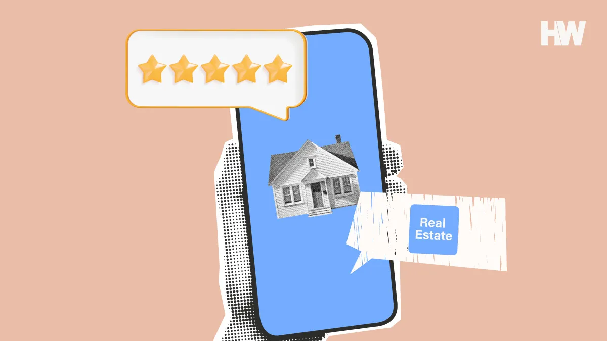
Element 5: Add social proof to build trust
Add genuine reviews or short testimonials from Zillow or Realtor.com to build trust with your visitors. If your visitor has stayed on your landing page long enough to read it, they might be on the fence about giving you their contact information. Social proof shows them that other people not only trusted you but also liked working with you. This will help melt away any last-second resistance or hesitation.
- Example: See image below.
- Objection handled: “Why should I trust you?”
Element 6: Images that highlight the benefits of the offer
The saying “An image is worth a thousand words” is a cliche for a reason – it’s true. This is why high-converting landing pages almost always include emotionally compelling images that highlight the benefit of accepting your offer. Think, beautiful homes, a happy family, a couple smiling as they unpack boxes in their new home, you helped them close on.
- Example: See image below.
- Objection handled: “I am still not sure I am ready to hand over my email address to get this offer.”
Related articles
The 8 best real estate website builders of 2025
Examples of high-converting real estate landing pages + why they work
Okay, now that you understand all the elements that need to be part of a high-converting landing page, and the goals and persuasion techniques that help sell, let’s dig into some real-world examples.
Home valuation landing pages
Home valuation landing pages are an excellent way to connect with homeowners still in the curiosity stage of selling their homes. They offer a simple yet compelling alternative: an expert opinion of their home’s value that’s more accurate than a Zestimate. Once you have their contact information, an in-person home valuation is an easy upsell.
Example 1 – The Abode Group: What’s your home worth?
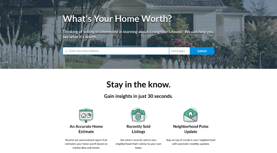
Why it works: Simple and straightforward, this home valuation landing page uses clean design and clear and compelling copy and images to convince a visitor to click.
What you can do:
- Dig deeper into benefits in your subheadline. This subheadline cleverly highlights the additional benefit of discovering the value of your neighbor’s house.
- Use a pleasing and contrasting color for your CTA button. The blue button pops on the page.
- Break up persuasive copy with icons or images. Instead of long paragraphs, this page breaks up copy with icons and subheadings. Easier to skim. Gain insights in 30 seconds is a highly effective objection handler for visitors who are short on time.
Example 2 – Redfin: How much is my house worth?
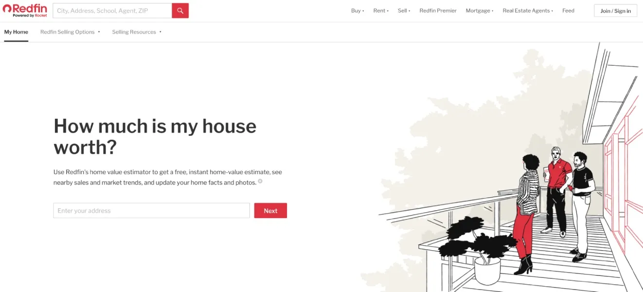
Why it works: With its bold red CTA button, attractive on-trend illustrations and plenty of white space, Redfin’s home valuation landing page offers an important lesson: simplicity sells.
What you can do:
- Dig deeper into benefits in your subheadline. Copy like “free, instant home valuation” highlights benefits and handles objections around time.
- Use a pleasing and contrasting color for your CTA button. The red button pops on the spare white page.
- Use emotionally compelling images. The trendy illustrations highlight a key benefit of homeownership: relaxing with friends or family on your deck.
Example 3 – Homelight: How much is my house worth?
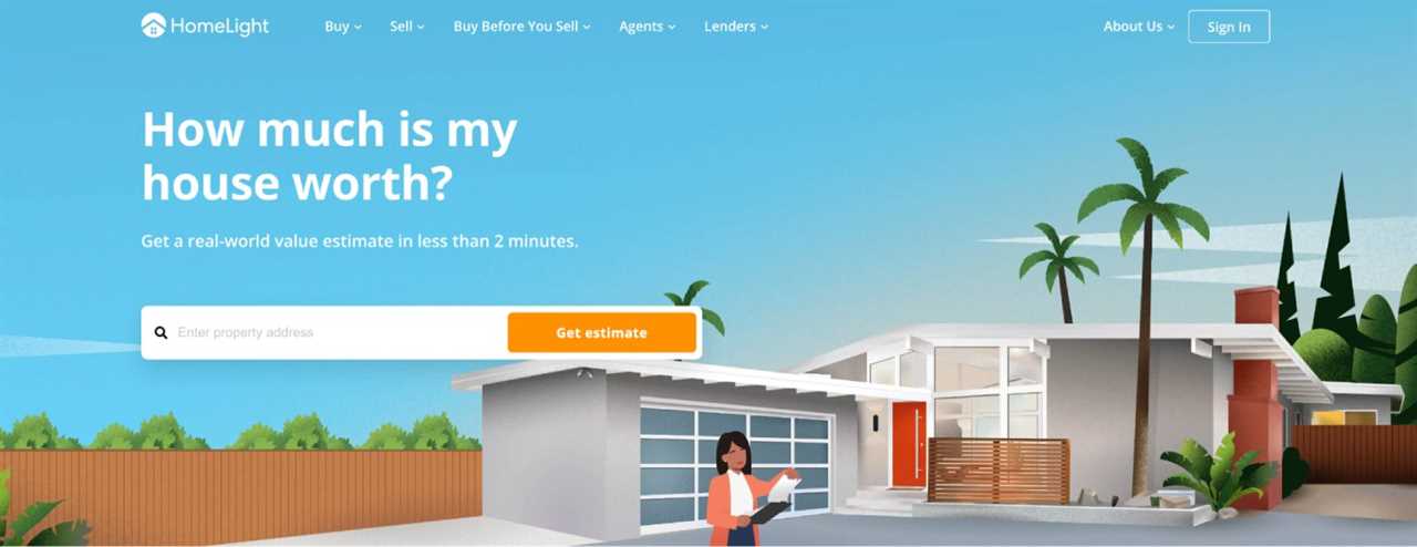
Why it works: Clean, simple and uncluttered, this home valuation landing page is designed for conversion.
What you can do:
- Dig deeper into benefits in your subheadline. The subheadline emphasizes how fast the visitor will get their home valuation: two minutes! If you are offering an instant home valuation, say so on your landing page to help convince people to click.
- Use a pleasing and contrasting color for your CTA button. The orange button pops on the blue background. It’s the most most salient element on the page.
- Use emotionally compelling images. The illustration shows a Realtor standing outside a very desirable-looking home. She is hard at work.
Related articles

Generate real estate seller leads: 13 proven strategies + tools

Comparative market analysis (CMA) reports: The ultimate agent guide
Listing consultation landing pages
The classic “sell with us” landing pages are a mainstay of every real estate website and one of the best ways to generate seller leads online. These examples use clever copy, simple graphic design and emotionally compelling messaging to increase conversions.
Example 4 – Corcoran: Selling? You’ve come to the right place.
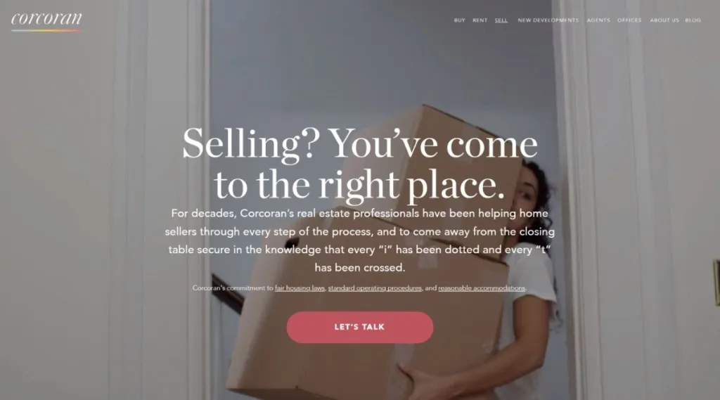
Why it works: Corcoran’s seller landing page leverages clever copy and imagery that empathizes with a common seller pain point – the stress of moving — an effective way to highlight one of the main benefits of working with a listing agent.
What you can do:
- Use a friendly CTA. “Let’s talk” subtly reminds people that the next step is a conversation with a caring and empathetic expert who can help solve their problem.
- Use a pleasing and contrasting color for your CTA button. The soft terracotta pink of this button is on-trend and doesn’t scream pushy salesperson.
- Create a visual hierarchy that leads to your CTA button. The headline and body copy are centered and lead directly to the CTA button. Clicking feels like the natural thing to do after reading.
- Emotionally compelling images that highlight a key benefit. The woman in the image literally has her hands full moving boxes. The message? Moving is stressful enough. We can take the stress of selling off your plate.
Example 5 – Bond Street Partners: Sell with us
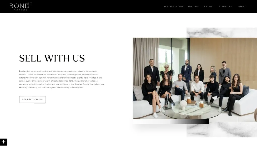
Why it works: More elegant than trendy, this landing page leverages a simple, direct headline, “Sell with us,” with creative CTA button copy: “Let’s get started.” Instead of empathizing with the seller’s pain points, they include a team photo inside a beautiful listing. The message is clear — these are sophisticated professionals who sell high-end homes.
What you can do:
- Add your headshot. Adding a headshot or team photo reminds sellers that there is a friendly, empathetic human behind the page.
- Use copy that’s creative, but not TOO creative. As a general rule of thumb, if you use creative copy for your headline, use more traditional copy in your CTA button.
Home search landing pages
Promoting your IDX website where people can search for homes? Your landing page must give them exactly what they want, right away. Instead of social proof, headlines and supporting copy, these landing pages must present search results in a clean, intuitive interface.
Example 6 – Jack Conway: Easy property search
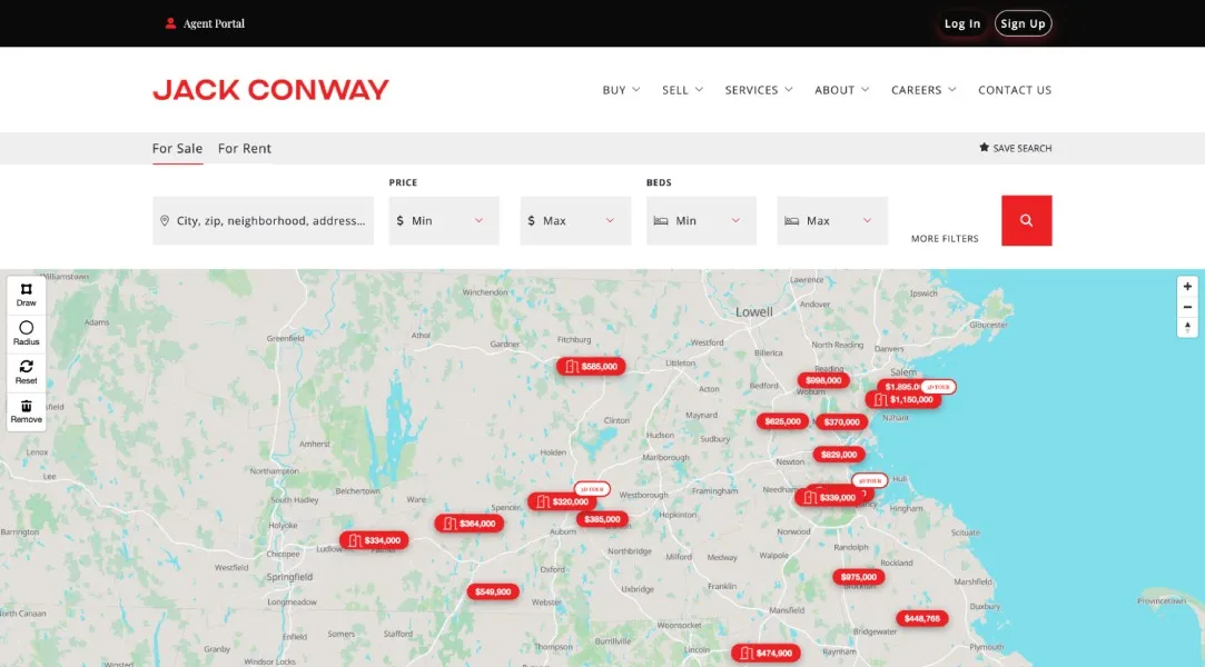
Why it works: Jack Conway’s home search landing page gives visitors exactly what they want and nothing they don’t. The map dominates the above-the-fold section, with the search feature right above.
What you can do:
- Make it easy. Do not distract people who are searching for homes with superfluous bells and whistles. Just let them search! You can capture their contact information with a simple lead capture pop-up, available on nearly all IDX website builders.
- Use contrasting colors to draw visitor attention. Notice how the red highlights the properties, search button and agent name, which are exactly where you want visitors to click.
Cash offer landing pages
Cash offer landing pages are all about Benjamins. Sellers considering cash offers only want to know two things: How much you can give them for their home, and how much stress you can remove from the selling process.
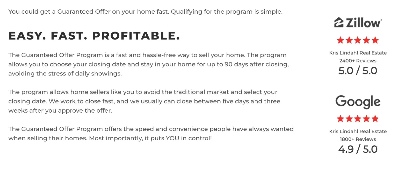
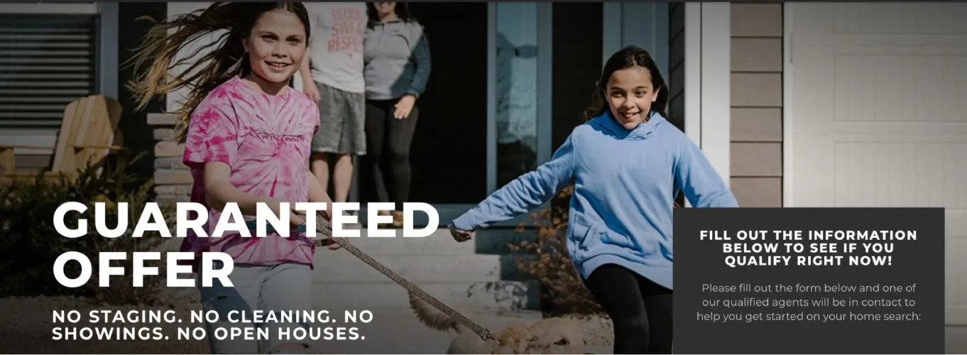
Example 7 – Kris Lindhaul: Guaranteed Offer
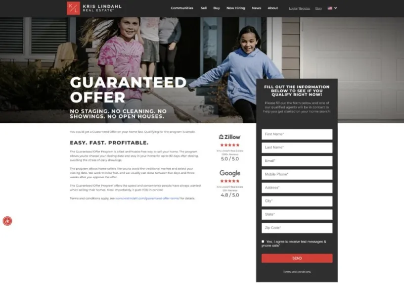
Why it works: This cash offer landing page uses ruthlessly simple and empathetic copy to convince people to sign up. The headline is clear, and the subheadline hits the pain points of selling a home in just nine words. Below, they present their solution to those pain points with just three words: Easy. Fast. Profitable. Social proof is cleverly placed right next to the lead capture form — exactly where most people will have second thoughts about giving away their contact information!
What you can do:
- Include social proof. Including Zillow and Google ratings above the fold reassures skeptical homeowners that this broker is trustworthy and competent.
- Highlight benefits, not features. The copy focuses on the benefits — easy, fast and profitable — that a homeowner will get with a cash offer.
- Add emotionally resonant images. Instead of a stock photo of a home, this page features happy, smiling children. The message is: “If you work with us, your children will be happy.”
Related articles
8 best places to buy real estate leads in 2025

The 8 top real estate lead generation companies for 2025
The full picture
Landing pages are crucial tools for converting online traffic into qualified leads and achieving a better ROI from paid leads. Focus on clear and emotionally compelling copy, personalize your CTAs, add a dash of social proof, use clean design and watch your conversion rate soar.
------------Read More
By: Megan DeMatteo, Emile L'Eplattenier
Title: How to build high-converting real estate landing pages (+ examples)
Sourced From: www.housingwire.com/articles/real-estate-landing-pages/
Published Date: Fri, 01 Aug 2025 21:35:45 +0000


Making the Switch: A Practical Guide to Home Electrification

Hauliers, hotels and farms warn they are ‘in survival mode’ as fuel costs spiral

Rethinking organizational design in the age of agentic AI
What happens to mortgage rates if the Iran conflict is over?