Exposed concrete, sparse interiors, and stark geometric forms don’t exactly exude warmth. So why are so many new hotels embracing brutalism’s hallmarks?
Brutalism may not be the first aesthetic that comes to mind when you fantasize about your next luxury hotel stay. The divisive architectural style, which emerged in the 1950s on the heels of the modernist movement, is famous for its use of raw materials, particularly concrete, and its imposing geometric forms. Brutalist designs tend to eschew decoration, even warmth altogether in favor of utilitarianism. After brutalism began to fall out of favor in the late 1970s, many of its gargantuan facades faced neglect or the threat of demolition. But the last decade or so has seen a number of real estate developers and hoteliers reviving brutalist buildings into book-them-now accommodations. This seems to have inspired a full-on embrace of brutalism in hospitality, as even some newer hotels built from the ground up are channeling the style’s harsh visual language.
Take The Ned in Doha, which opened just in time for the World Cup 2022 in Qatar. Chipperfield Architects was tapped to transform the four-story former Ministry of Interior building, originally designed by Lebanese architect William Sednaoui in the 1970s, into the kind of five-star bolthole that can compete in Doha’s upscale lodging market. Quintessentially brutalist elements, like the original sculptural facade and waffle ceilings, are tempered with more sumptuous surfaces like travertine and green marble walls and staircases. In the guest rooms, plush velvet upholstery, scalloped headboards, and sculptural glass chandeliers juxtapose the austerity of the concrete foundation. The soaring atrium—a common fixture of many brutalist buildings—acts as the heart of the property. Its brise-soleil ceiling composed of concrete slats creates an interplay between the vertical and the horizontal, an oft-referenced relationship in brutalism.
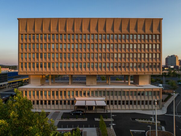
Architect and developer Bruce Redman Becker of Connecticut firm Becker + Becker bought a landmark brutalist building in New Haven designed by Marcel Breuer in 1970 and converted it into an energy-efficient 165-room boutique hotel.
Courtesy Hotel Marcel
Another opening that pushed the brutalism-belongs-in-hospitality campaign forward in recent years is Hotel Marcel in New Haven, Connecticut. Originally designed by Marcel Breuer in the 1970s as the headquarters for the Armstrong Rubber Company, the hulking concrete tower was later listed on the State and National Register of Historic Places, but eventually abandoned for 20 years before architect Bruce Becker of Connecticut firm Becker + Becker bought the site and converted it into a 165-room hotel in early 2020. "Sitting there with the lights out for so long, the building became a symbol of decline and abandonment," Becker says. "But as soon as we cleaned the facade and put shiny windows in, people are now flocking." Of course, converting the roadside tower into a welcome boutique hotel involved more than just surface shining. Brooklyn-based firm Dutch East Design reimagined the interior with an off-white and warm wood palette punctuated with plush couches, abstract woven area rugs, and a selection of works by Bauhaus artists like Anni Albers and Gunta Stölzl. Breuer’s Cesca chair, upholstered in a patterned textile, is in every room, too.
While The Ned’s glammed up decor offers a much more obvious contrast to its building’s austerity, Hotel Marcel’s interiors, relate to that brutalist enormity more cohesively. There are pops of color and a playful melange of textures, but the overarching scheme feels largely in-line with modernist ideals. Design aside, there are, Becker notes, some inherently valuable elements of brutalist construction that make perfect sense for hospitality. Most of the imposing juggernauts, for example, are incredibly well-insulated, a feature Becker says hotel guests are benefiting from. "We’re a couple of hundred feet from the busiest highway in Connecticut, and you can hear a pin drop in the rooms even if there are tractor trailers rumbling by," he says. "People have told us that these are the quietest rooms they’ve ever stayed in."
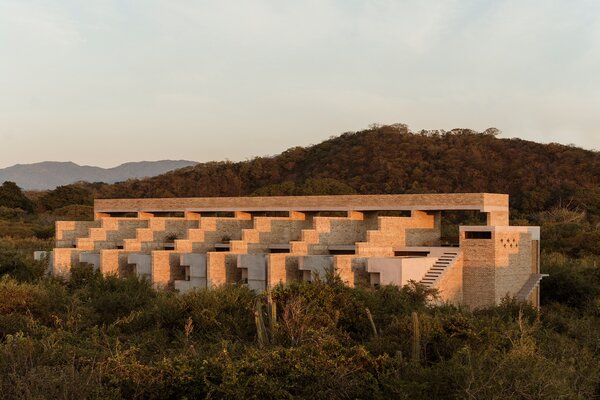
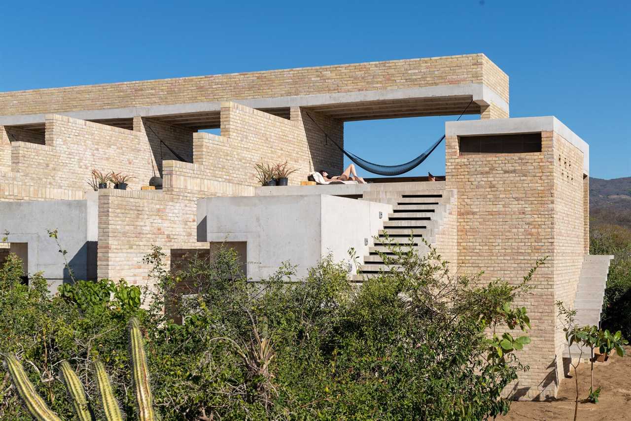
Boutique hotel developer Grubo Habita tapped Mexican architect Alberto Kalach to design the brick-and-concrete Terrestre Hotel along the jungle coast of Puerto Escondido in Oaxaca, Mexico.
Photo: Fabian Martinez
Some hoteliers find the style’s hallmarks so seductive that they’re commissioning brand-new brutalist buildings altogether. On Mexico’s Oaxacan Coast, for example, premiere hospitality brand Grupo Habita tapped Mexico City-based architect Alberto Kalach to build the brick-and-concrete Terrestre Hotel surrounded by Sierra Madre Occidental mountains, the Pacific Ocean, and the jungle. Its sharp, staggered lines and bare surfaces fall in line with Mexico’s architectural heritage, at least aesthetically. "Brutalism feels endemic to Mexico; it is rooted in our culture," says Grupo Habita cofounder Carlos Couturier. "Aztec pyramids are brutal. Colonial cathedrals and haciendas are brutal. Public buildings from the dictator’s time are brutal. The post-Mexican revolution’s architecture is also brutal."
Terrestre, in all its austerity, employs brutalism’s characteristic focus on functionalism. There is no air-conditioning; instead, the hotel was built to run parallel to the coast with no structural obstacle for the sea breeze to flow freely throughout the building. For cross ventilation like this to work, Couturier says, "we needed a solid structure. Brutalism provides that strength."
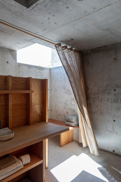
Terrestre Hotel’s brutalist-style design employs passive cooling methods. The 14-room retreat relies on solar power.
Photo by Jaime Navarro
See the full story on Dwell.com: The Brutalist Hotel Paradox
Related stories:
- The Midcentury-Modern Colored Tile Bathroom Is Back, Thank God
- The L.A. Mansion Tax Comes for "Selling Sunset"
- One Night in a New Boutique Hotel From Baltimore’s Most Beloved Design Shop
Read More
By: Chadner Navarro
Title: The Brutalist Hotel Paradox
Sourced From: www.dwell.com/article/the-brutalist-hotel-paradox-fd318c32
Published Date: Fri, 10 Nov 2023 13:32:18 GMT
Did you miss our previous article...
https://trendinginbusiness.business/real-estate/make-your-home-smell-like-a-crackling-cozy-fireplace
.png)

