Before purging your belongings to tidy up à la Marie Kondo, consider this organizational tactic championed by two artists with ties to the American furniture manufacturing company.

Welcome to Sitting Pretty, a column that shows how past design trends still shape our homes today.
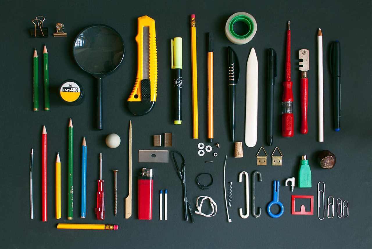
When Tidying Up with Marie Kondo debuted on Netflix in January 2019, the Japanese decluttering guru skyrocketed from a best-selling author to a popular culture phenomenon. Her name became a philosophy and a verb: "Kondo-ing," or keeping the items that "spark joy" and tossing the ones that don’t. Fast forward to 2023, however, and the Kondo boom feels like the last hurrah of a particular type of the prescriptive, white-knuckled minimalism that felt inescapable for much of the past decade. Enter "knolling," a totally different organizational method born from the studio practices of artists, designers, and DIYers that involves laying out related objects—paint pens and ink markers, wrenches and chisels, metal chains of all sizes—in a precise but simultaneously stylish way, intended to streamline workflow. The organizing practice feels uniquely suited to meet this aesthetic moment and rife with potential as an interior design philosophy, focusing on highlighting your belongings instead of discarding them.
The push against minimalism—and backslide toward some strain of maximalism—revved up in 2020. It wasn’t all Kondo’s doing. In a post-Kinfolk world, we were promised bliss, but ended up bored in sparsely decorated homes when a pandemic brought the world crashing to a halt. A Guardian excerpt from tech and culture reporter Kyle Chayka’s book on minimalism pointed to "the empty promises of Marie Kondo." Writing about Chayka’s book and the Kondo craze for The New Yorker, author and essayist Jia Tolentino cut directly to new minimalism’s core message: "Don’t organize—purge." Architectural Digest and Apartment Therapy would later dive into the aesthetic shift toward micro-trends like "cluttercore."

The term "knolling" refers to the act of arranging objects at right angles to each other or the surface they rest on. Sculptor Andrew Kromelow coined the name in 1987 while working as a janitor in Frank Gehry’s studio; artist Tom Sachs, who also worked in Gehry’s studio at the time, popularized the organizational concept.
Courtesy of Knoll Inc.
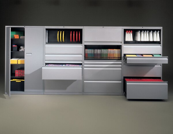
If Kondo-ing puts the emphasis on purging, then knolling emphasizes keeping and organizing. The concept’s name is synonymous with the American furniture manufacturing company shepherded by late architect Florence Knoll that rose to a midcentury promised land for industrial designers of all disciplines, offering sharp silhouettes and geometric forms. (Also, lots of office systems.) However, it was contemporary artist and provocateur Tom Sachs who popularized Knoll’s last name as a shorthand for the method of "arrang[ing] like objects in parallel or ninety-degree angles as a method of organization."
"I know that Tom Sachs is where it proliferated," says Amy Auscherman, director of archives and brand heritage at MillerKnoll (the collective formed after fellow design titan Herman Miller acquired Knoll in 2021). "It’s a point of pride to be able to say the company name is also a verb." While the blue-chip artist laid out the rules for knolling and championed the concept into the creative world, sculptor Andrew Kromelow originally invented it. Both men worked in Frank Gehry’s Santa Monica studio during the late 1980s; Kromelow was in charge of keeping the workshop tidy as a janitor and would feverishly organize so that workers could quickly and clearly see all the tools at once. At the time, the Gehry studio was constructing a bent-plywood chair for Knoll. The name stuck.
"Tommy absorbed it and made it his own," Kromelow later told Communication Arts. "I’m glad it has become such a universal system. It makes sense because as human beings and artists, we all crave making order out of disorder."

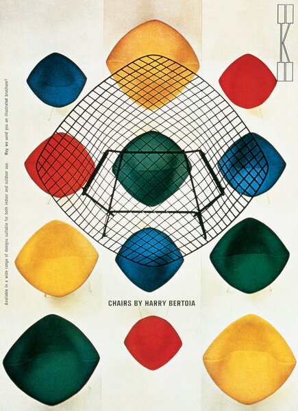
Early print advertisements for the American furniture manufacturing company displayed an aura of artful tidiness that epitomized the "knolling" concept.
Courtesy of Knoll Inc.
In the early 1990s, Sachs moved from Los Angeles to New York to start his own studio. Knolling remained a mainly internal word until he released "Working to Code" in 2010, an instructional video of sorts that can now be purchased as a printed and bound zine. Over the next decade, knolling would go from Sachs Studio jargon to industry-wide terminology.
The style boomed in marketing and advertising, known as "flat-lay" photography, used by everyone from massive fashion retailers to beauty product companies. A Webby Award–winning Tumblr blog called Things Organized Neatly, featuring images of everyday objects laid out pleasingly and photographed from above, landed a book deal with the glossy arthouse publisher Rizzoli in 2016, the foreword written by none other than Tom Sachs. The long-running "Essentials" series by streetwear publication Hypebeast—with daily must-haves and cherished objects of prominent figures like Virgil Abloh, Russell Westbrook, and Sir Richard Branson—uses the method for its imagery. The photo style even found a more grassroots adoption via the ultra-popular "Everyday Carry" subreddit. All of these hyper-organized layouts are easy to recognize as knolling.
In Florence Knoll’s old "paste-ups," furniture and layout details were meticulously arranged to present finished interior concepts to clients. Several early print advertisements for the company also carried an aura of artful neatness. "Florence was an architect first and foremost," says Auscherman. "The way she practiced furniture and interior design was sort of like knolling in 3D. She studied with Ludwig Mies van der Rohe, and his architecture is the epitome of the knolling concept. Very considered angles."

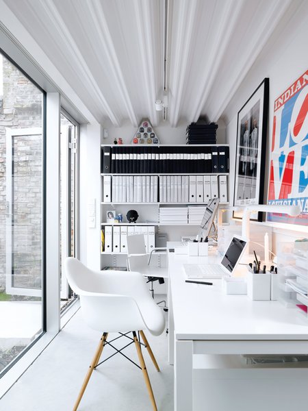
The organizational method, which focuses on neatly highlighting your belongings instead of discarding them, is rife with potential as an interior design philosophy.
Photo: Mark Seelen
See the full story on Dwell.com: The Life-Changing Magic of "Knolling"
Read More
By: Tyler Watamanuk
Title: The Life-Changing Magic of "Knolling"
Sourced From: www.dwell.com/article/the-life-changing-magic-of-knolling-5efe3c96
Published Date: Mon, 09 Jan 2023 17:33:36 GMT
.png)


