.png)
Visualizations in business intelligence software are often dismissed as a “commodity”, interchangeable and easy to overlook. But what this perspective ignores is that visualizations are a gateway to better understanding data. Instead of parsing through raw data, they make key details and trends visible so that users can easily interpret the insights derived from all the data gathering, preparation, and analysis.
This becomes especially critical in embedded analytics, where crafting the perfect dashboard or report design with the right functionality for your users can make or break their experience. Even seemingly common elements like charts must go beyond the basics, incorporating the right representation of your data and its important context to communicate messages accurately and lead you to critical insights.
They’re also in-demand; according to an embedded analytics report by insightsoftware and Hanover Research, 83% of data leaders see innovative visualizations as an important trend.
Table Stakes: Can Your Tables Do This?
Learn More
The Managed Dashboards & Reports offered by Logi Symphony from insightsoftware are packed with features that might just surprise you, which can make all the difference in how you and your users experience data. Here’s what you might not know you’re missing.
Recommendation Engine
Logi Symphony ships with over 25 chart types built in and fully supported, ensuring consistent quality without relying on third-party extensions. And that’s before counting other visualization types like tables, maps, treemaps, and relationship diagrams. There’s no need to be overwhelmed by the number of choices, however.
You don’t have to be overwhelmed if you don’t know where to start. Instead, Logi Symphony can choose for you by simply adding the data you want to see.
At each step, the most commonly appropriate chart type or other visualization will be created automatically for you based on best practices. The Re-Visualize menu then provides you with other recommended choices. If none of the recommendations fit what you need, you can keep looking through the complete list and make your own choice. Added calculations can also be recommended such as trend lines and forecasting.
Automatic re-visualizing will stop as soon as you make your own choice or customization, but the recommendations are always available.
Call Attention
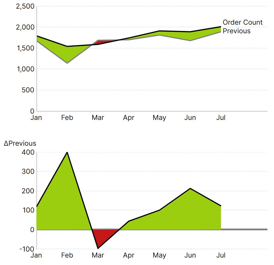
Dashboards and reports aren’t usually just reporting the numbers on their own but against important context like budgets, targets, or previous periods such as year-over-year. Help ensure problems grab attention with states, or conditional formatting, a capability that Logi Symphony makes straightforward.
Avoid Vendor Lock-in With Cloud-Agnostic BI
Learn More
Conditional formatting is available for all Managed visualization types for making a variety of customizations based on conditions, but especially changing colors or making other indications of data that needs attention. This extends beyond simply changing bar colors, for example to a Range chart visualizing the difference between this year’s and last year’s numbers, or an Area chart showing the calculated difference, also known as an absolute variance (symbolized with ∆):
Changes in color extend to the intersections of the lines, even when curved to represent continuous or natural phenomena:
Bar Layouts
Sometimes a bar chart isn’t just a bar chart: with Logi Symphony, you don’t need to wonder whether the particular design you need is possible.
Whether it’s a stacked bar chart with grouped stacks (using the “Side-By-Side Position” option):
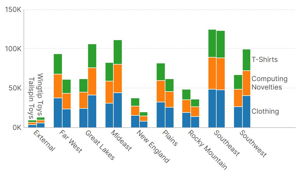
A proper histogram, created with a single click from the Re-Visualize menu:
Or a bar layout like the one used by IBCS to show previous period data partly behind the actual data, as shown next (using the “Series Overlap” option).
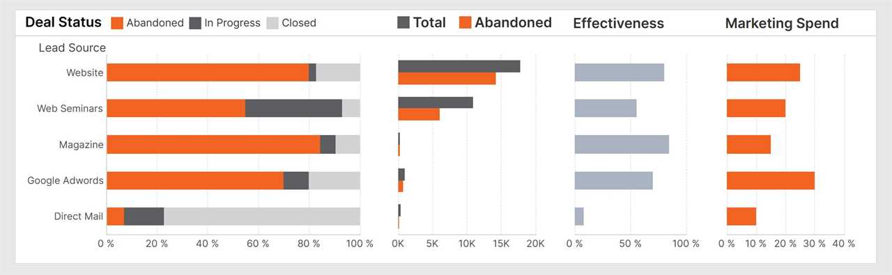
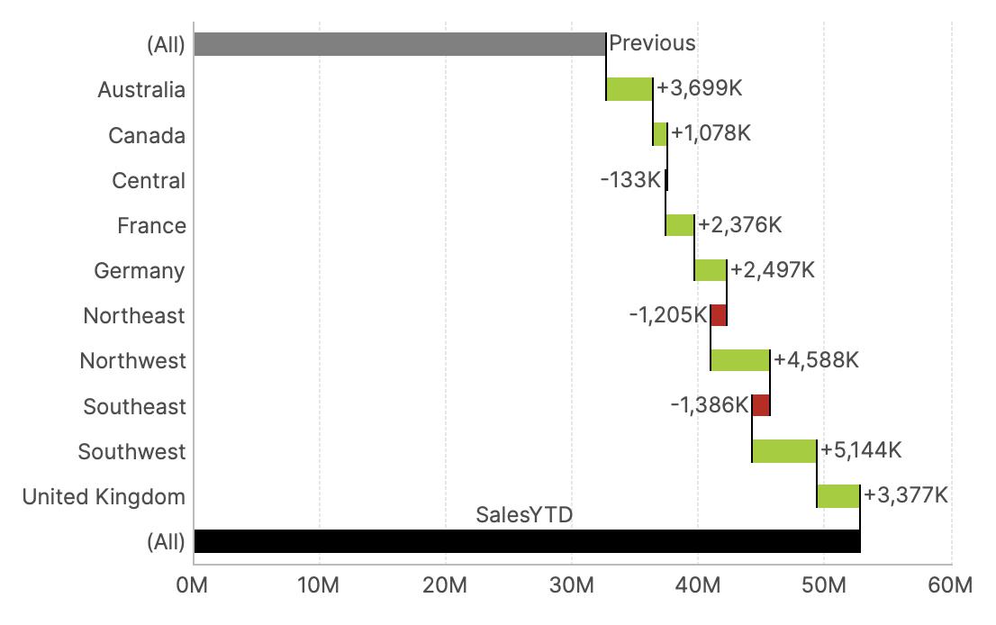
Variance Charts
Breeze through creating well-designed, context-rich charts for analysis of your data with just a few clicks in Logi Symphony, following the same streamlined approach as with tables. The “Add Variance Charts” option in the Re-Visualize menu asks you only to assign your Actual and Previous or Plan measures, and the rest is done for you.
Starting with only the chart on the left shown above with the blue bars, the two charts to the right are then entirely generated for you automatically.
Aligned Charts
When you have multiple charts positioned next to each other or in a grid, it’s a few simple clicks to make their axes visually line up. To do so, click Chart Properties > Align Axes in the toolbar, and simply select the charts.
To make axes in separate charts always display the same values in the same positions, just add them as “Shared Axis Scales” and the system will handle the rest.
These features are set up for you automatically when creating variance charts as shown above so that one vertical axis on the left applies to all three charts. You can use them whenever comparing data side-by-side that share values along an axis:
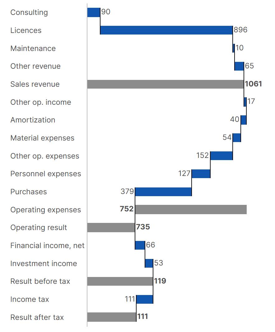
Waterfalls
You can go beyond basic waterfall charts to profit & loss statements, for example, including totals and subtotals:
Or have a “Variance Waterfall” calculated and set up for you automatically:
Pie and Sunburst Charts
You can make a pie chart interactive in Logi Symphony.
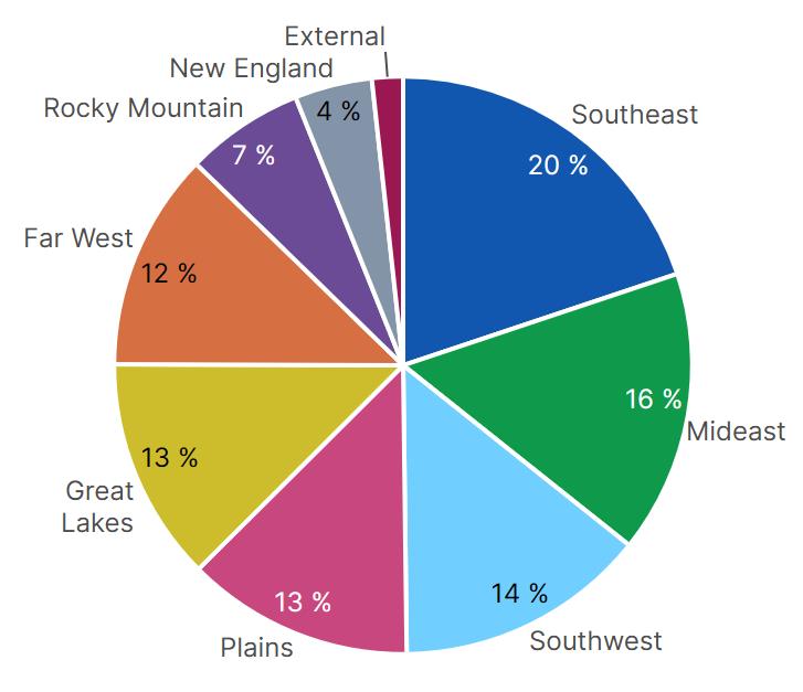
If the pie chart above visualizes a multi-level hierarchy, viewers by default can right-click to maximize it as needed and expand each slice into a sunburst. The chart can be set up to expand on left-click as well.
Animations
Modern chart animations are for more than visual appeal by supporting intuitive data exploration. Logi Symphony takes this even further, animating all changes to data and axes in charts while also animating each kind of change separately to ensure viewers perceive each one.
When drilling down or expanding/collapsing, data points split up and merge accordingly so you can keep track of what’s changing.
The Basics
Sometimes it’s the simplest features that make the biggest difference, ones you might not even notice until they’re missing. Take axis labels for example. With Logi Symphony, you don’t need to worry about your text being unexpectedly cut off no matter how the chart is resized, which could lead to confusion over this critical information. By default, the text is intelligently wrapped, rotated, and resized as needed automatically.
More capabilities are there when you need them. You can even combine almost any chart types together. For example, using Point type data points to plot milestones over Range Bars showing task progress (only radar and pie chart types are separate from the others). Display any number of axes on each side of the chart, or show multiple data point labels at once, such as the percentage labels inside and text labels outside of the pie charts shown above. You can even display multiple datasets together in a single chart, adding ranges to mark significant events along your time axis or incorporating custom axis labels.
Logi Symphony: Empowering Data-Driven Insights with Seamless Customization
Logi Symphony from insightsoftware and its Managed Dashboards & Reports are designed with one goal in mind: empowering you to create the perfect content to share with your users. Every detail has been carefully considered to provide a seamless, intuitive experience that turns raw data into actionable insights.
From flexible, interactive, and animated charts to advanced customization options, Logi Symphony ensures that you and your users have everything needed to analyze, collaborate, and present data effectively. Whether it’s tailoring labels, highlighting important data, or automatically calculating a critical analysis, every feature is designed to make your data work harder and smarter.
We’ve thought about the details so you don’t have to. With these powerful tools at your disposal, you can focus on what really matters: delivering insights that drive smarter decisions, faster. More than just dashboards and reports, it’s a platform that empowers you to tell the right story with your data, every time.
Ready to learn more? Watch our on-demand webinar on how to embed predictive analytics into your application.
How to Embed Predictive Analytics into Your Application
Watch Now
The post Raising the Bar: Can Your Charts Do This? appeared first on insightsoftware.
------------Read More
By: insightsoftware
Title: Raising the Bar: Can Your Charts Do This?
Sourced From: insightsoftware.com/blog/raising-the-bar-can-your-charts-do-this/
Published Date: Fri, 01 May 2026 15:50:24 +0000