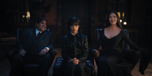
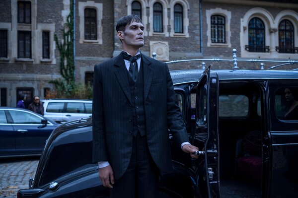
The cult characters have always been certifiably macabre, but with each remake, including Netflix’s new ‘Wednesday’ series, their iconic Gothic style has evolved.
"Creepy, kooky, mysterious, and spooky," the Addams family are back again with Netflix’s new Wednesday series, directed by none other than cult horror and gothic fantasy filmmaker Tim Burton. The eight-episode remake joins a long line of Addams Family adaptations focused on Gomez, Morticia, Wednesday, and Pugsley Addams. But this time, as its name suggests, the focus turns to the morbid, pigtailed, now-teenage Addams daughter as she enters an entirely new setting (more on that below). While Netflix’s take stays true to the Addamses’s defining penchant for the macabre, it also illuminates how with each remake, the family’s iconic Gothic aesthetic has evolved in tandem with the zeitgeist.
The Addams family first appeared in a 1938 New Yorker comic by cartoonist Charles Addams, which marked the earliest sketch in a long-running cartoon series depicting the ghoulish family. In 1964, the fictional characters slunk their way onto TV with a black-and-white ABC sitcom based on Addams’s cartoons, and in 1973, an animated adaptation followed. The Addamses were resurrected during the 1990s for two hugely popular live-action films directed by Barry Sonnenfeld, as well as another animated show, TV series, and live-action film (with a different director and mostly new cast). In more recent years, the Addamses were also the center of a dedicated Broadway musical and two more animated films. And now, we have Netflix’s Wednesday.
In all of these incarnations, there has been one constant: the Addams family’s fascination with the ghoulish and gruesome. The characters are certainly mindful of aesthetics—they fill their home with all of the spine-chilling, unsettling things they can; there are surrealist paintings (a brutal otherworldly shipwreck, a man attacked by his own shadow), disturbing ghostly sculptures covered in cobwebs, and creepy wall hangings (a taxidermy moose with one broken antler, elephant tusks, a noose). As the theme song states, "Their house is a museum." It also apparently has a mind of its own—and is up for a good joke. Door knockers move, bear rugs roar, floor boards come out of nowhere to trip up unwanted visitors. It’s like the decrepit Victorian mansion is an unspeaking member of the family.

Netflix’s Wednesday series joins a long line of Addams family adaptations depicting Gomez, Morticia, Wednesday, and Pugsley Addams (as well as Uncle Fester, Grandmama, Cousin Itt, their butler, Lurch, and the disembodied hand, Thing).
Courtesy of Netflix
In the 1964 ABC sitcom, for example, the ominous, rickety Addams family mansion looms against a backdrop of cookie-cutter 1960s suburban homes. The first episode sees the family dealing with a truant officer who arrives at their house to find out why the children aren’t enrolled at the local school. BEWARE OF THE THING, warns a sign on the rusted front gate overgrown with dried weeds, which creaks open on its own accord. The doorbell yanks the officer into the doorframe. Inside, a polar bear rug roars at him as he passes by. A swordfish head hangs on the wall with a disembodied leg dangling from its mouth. As the officer sees more of the mansion, he gets increasingly freaked out. It’s a slapstick, gag-heavy show punctuated by a steady stream of canned laughter with a haunted but humorous look to match.
"The aesthetic of the original Addams Family series was a mix of Victorian and Gothic, which commonly overlap in design," says Diana Hathaway, interior designer and longtime Addams family fan. "[While] the set was decorated in pink and other light, Victorian-inspired colors, shooting in black and white—though color was starting to become more common—gave the Victorian furnishings a moody look." The sitcom’s take on the Addams family house, filled with bizarre curios, set the tone for the family’s on-screen aesthetic for generations to come.
It’s the ultimate haunted house with an antique shop from hell vibe, complete with dated velvet furnishings, cobweb-filled corridors, and hidden passageways.
Decades later, the Barry Sonnenfeld–directed films followed in the strange, comedic tradition. The design of the family’s creaky Victorian mansion was also a clear homage to the 1964 series—it’s the ultimate haunted house, with an antique shop from hell vibe, complete with dated velvet furnishings, cobweb-filled corridors, shadowy rooms, dripping candles, and hidden passageways. There are even a few direct nods to the 1960s iteration, including the giant taxidermy bear that looms over the entrance hall and the growling polar bear rug, plus the conservatory where Morticia feeds her carnivorous plant named Cleopatra and cuts the buds off thorny roses, keeping only the stems. But the early 1990s films also forged a new aesthetic path for the Addamses that "moved away from the fussy Victorian-Gothic style of the original series and into a Steampunk aesthetic," says Hathaway. The set design honed in on the mechanical side of the Addams family mansion, with gears, pulleys, and cogs taking a front seat in the structure.
"As entertainment tastes changed, the sets used saturated colors and dramatic lighting to create a more menacing look," Hathaway says. The films brought deep scarlets, burgundies, and mauves into the Addamses’ palette, which offered a more striking, sinister backdrop that veered away from the slapstick-style sitcom. "With the new emphasis on action and drama, the busy and cartoonish set design of the original series was not part of the new aesthetic," she continues.

As new creative teams have taken up The Addams Family mantle, the cult classic aesthetic has morphed accordingly.
Courtesy of Netflix
The 2010 Broadway musical brought the Gothic-Victorian house to life with deep-red velvet furnishings, rich blue and purple lighting, and ample use of a fog machine, and the 2019 and 2021 animated movies fashioned a similar backdrop with ornamental wallpaper, dusty antiques, and gloomy lighting. But Tim Burton’s Wednesday ventures beyond the familiar Addams family setting and into Nevermore Academy, a boarding school for supernatural outcasts where Wednesday is a new student. Showrunner Alfred Gough, who created the series with Miles Millar, told Netflix in a press release: "Nevermore Academy is a new setting that we created. We knew Wednesday wasn’t going to be with her family for most of the show, but we definitely wanted to have the vibe of The Addams Family—a Gothic, visually compelling place filled with quirky characters, a place that’s very much in the DNA of the Addams family."
In the series, Nevermore is a rambling Gothic mansion in New England with lopsided turrets, secret rooms, and enough dark and dated decor to instantly recall the Addams family aesthetic. In fact, the academy’s roof was reconstructed with CGI to look like the iconic roof of the Addams family mansion, and in the headmistress’s office, a tall, stuffed bear looks suspiciously like the taxidermies that appear in the 1960s sitcom and 1990s films. In real life, however, most of the Nevermore scenes were filmed at Cantacuzino Castle in Romania. Production designer Mark Scruton told Netflix he was influenced by Bucharest architecture, which he called a "huge, eclectic pile of architecture, with Renaissance and Ottoman influences coming up through Transylvania."
"It was amazing to come here to Romania, because it just weirdly fit into the Addams family world," Burton added. Of course, Wednesday also forges its own aesthetic path, and Burton’s stylistic influence is undeniable. "When you say ‘Tim Burton,’ you immediately conjure up a visual aesthetic," said Gough.

The eight-episode series directed by Tim Burton retains much of the look and feel of the Addams family "universe."
Courtesy of Netflix
See the full story on Dwell.com: The Addams Family Aesthetic Has Been Done and Redone. How Do You Do It Again?
Related stories:
- Actually, You Shouldn’t Offer Help In Someone Else’s Kitchen
- What Is…Googie? These Devoted Fans Will Tell You
- One Night In a Hogan on Navajo Nation
Read More
By: Meg Walters
Title: The Addams Family Aesthetic Has Been Done and Redone. How Do You Do It Again?
Sourced From: www.dwell.com/article/how-the-addams-family-aesthetic-has-evolved-wednesday-netflix-series-6c9012eb-5ddaaba9
Published Date: Mon, 28 Nov 2022 18:57:45 GMT
Did you miss our previous article...
https://trendinginbusiness.business/real-estate/a-young-familys-brooklyn-townhouse-stands-apart-in-steel-cladding
.png)


